What Color is Your Instagram?

Moody rainy and happy sunny
Have you ever noticed how color can influence people's mood and behavior? Have you ever been sleepy or sullen on a gloomy rainy day and cheerful and energetic on a sunny day? Do you notice red price tags quicker than that of other colors?
So why not to play with colors on your Instagram account to attract new followers and even to influence your customers behavior?

The importance of first impression
The first impression of something we are looking at is created within 2 to 7 seconds. That is incredibly quickly. And the first impression is of great importance, because it is almost impossible to change it afterwards.
Moreover, when your followers are scrolling their feed, usually you have not more than a second to be noticed.

Instagram is purely visual; few words are written or pronounced there. Researches show that 60 to 90 per cent of assessment on Instagram is based on color. The colors of your picture can make people double-tap or scroll by. So, prudent use of color is in your best interest.
What color is for what?
Researches were carried out and it has been proved that color can really influence our minds. It was proved that different colors can evoke different emotions.

- It used to be thought that red and orange stand for strong emotions. Red is for passion, energy, sometimes even aggressiveness. Orange is for energy, excitement, enthusiasm and cheerfulness. In marketing these colors are usually used for encouraging impulsive shoppers.
- Yellow is believed to increase cheerfulness and warmth. It makes us more active, energetic and enthusiastic. It is frequently used to draw attention of window shoppers.
- Blue represents calmness and makes us more productive and easier to focus. Surely, it's not the best choice if you want to impose on impulsive shoppers or attract attention. It can even easily be passed unnoticed. But still there is also a good niche for blue. As it makes your customers feeling relaxed and safe, it can make your company looking more trustworthy.

- Green stands for health and tranquility. Companies that are represented as friendly to the environment usually choose green, because the first association for green is surely nature.

Features of different colors are used in designing interiors. For example, not often we can see a blue kitchen, but blue is quite often used in offices. Orange or green are not mostly used in a bedroom and you can hardly ever see a children's room in dark colors. Don't you think that that is done for a reason?
Colors even may influence our space perception. Light one can make you room looking more spacious, while dark one can make it smaller.
What color is more delicious?
Colors may can even influence your appetite. Red, yellow and green have the power to boost your appetite. They are the colors of fruits and vegetables. Restaurants often use red in their interior. Green is associated with salad, leaves, we decorate our food with some greenery for a reason.

Blue, violet and grey vice versa may reduce appetite. That is because the food of these colors is rare in nature.
Can you imagine yummy grey food? Ok, maybe Eastern sweet ‘halva', not many other options. So, that is not a very good idea to promote your café or restaurant with completely dull and grey profile. Also keep this information in mind if you are a food blogger.
But if you promote a diet, not using colors which boost appetite will make sense. As it would be logical to use blue and violet plates if you are on a diet.
Blue boys and pink girls
Studies show that men and women prefer different colors. It is not a secret that “blue is for boys” and “pink is for girls”. Although, some girls (especially teenagers) shout out loud: “No, I hate pink! Pink is not for me!” But it is not often heard from a man that he prefers purple over other colors.

Interesting fact is that men prefer bold colors while women have a passion for softer colors, shades and hues. So, if you are selling some stuff for men, it is better not to color your account with soft shades of sweet pinky or peachy and even bold purple. It is much better to use blue which is ‘trustworthy' or black which stands for power and strength. Of course, there are always exceptions from the rule. So, you may always experiment with this stuff.
How can you make your Instagram profile engaging by using color tricks?
If you post random photos without any color conception, you profile may look chaotic. While working with the colors of your Instagram account, keep in mind that the majority of people like color patterns with similar hues or with a highly contrasting accent color. Images with one main color are more often liked than that with more than one dominating color.
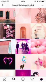
- Color-themed accounts are quite popular, when you are using a single hue for all the pictures so that all of them look cohesive.
- You can achieve this result by posting pictures of a certain color.
- Also, you can apply one filter to all your photos to add your account some harmony and attractiveness and to make it more stylish.
- Mix two techniques mentioned above. Repeat one color in different ways: with the help of filters, objects of this color and background on the photo.
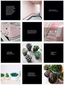
2. You may use one color for a background and some images which stand out. These images will be more noticeable and more likely to be clicked up and liked. You may use them to ask your customers to buy something. But don't overdo it.
3. Create a pattern. For example: post 3 photos of one color than 3 photos of the other one. Your profile will look more or less in an orderly manner. Or you may create a more sophisticated pattern, like that one with the effect of a chess board. You can create it using different-colored pictures or by alternating photos and text.
4. Play with borders or frames. They are not too widely used. So, this trick looks rather creative. For example, use one and the same white frame on all your images
5. If you post close-ups of your products, lighter images tend to be more likeable than dark ones. Less-busy background is also a good advice here.

The power of name
The name of color is also important. “Bubble gum pink” is more interesting than just “light pink”. ‘Mint' or ‘pistachio' is more pleasant than boring ‘green'. You can feel it yourself while reading these words. You can use this trick in your hashtags or in a caption.
For example, if you are selling a brown sweater, would you like to buy the one which is called ‘a brown sweater' or ‘a chocolate brown sweater' with a description of a cozy autumn evening with a cup of hot chocolate, a fire in a fireplace and rain outside the window. Second version evokes more emotions, doesn't it? But still don't forget that a caption should be concise and hashtags should be relevant.
Let's play with colors
All these examples are not strict rules which you must follow unconditionally. You may experiment and find your own tricks to design an attractive account and boost your likes and followers. Remember that you should pay attention to the context you are working within. Colors can help a lot when they are used in context with your background and features you want to emphasize.
So, play with colors and let the fame and prosper be with you!
Good luck!